...
|
|---|
Accessing the Tool
...
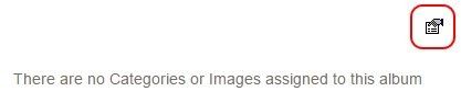
Click the ‘hand holding a napkin’ icon to access the settings. This will usually be to the top right of the Photo Album on the page.
This will launch the Photo Album Settings Interface.


Settings Overview
General Settings
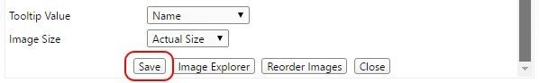
Save: When you’re finished making changes, remember to save before closing.
Title: Displays above the gallery. Not a required field.
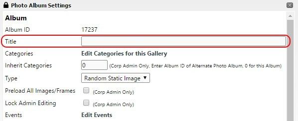
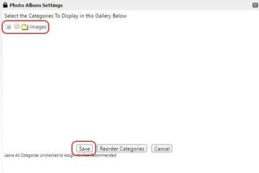
Categories: Specifies the folder(s) from which images are populated into the gallery. Multiple folders can be selected.
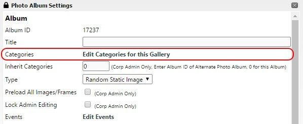
Edit Categories for this Gallery: Opens up the folder view of Image Explorer. Use Image Explorer to modify images and folders. Check any folder(s) you want included and click Save.
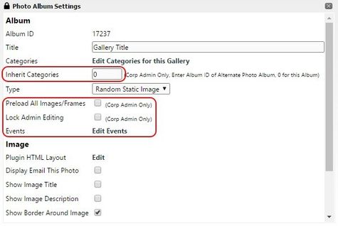
Events: Allows custom code integration during various transitions. Very advanced and generally unused.
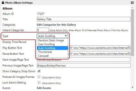
Type: settings for the type of photo album layout, such as: Random Static Image, User Scrolling, Auto Scrolling, Thumbnails, or Carousel.
- Random Static Image: Single random image that only changes on page reload. Rarely used.
- User Scrolling: Single full sized images with user ability to scroll through them. Rarely used.
- Auto Scrolling: Same as User Scrolling but with a timer and optional play/pause buttons. Often used as page headers.
- Thumbnails: Same as User Scrolling but with a thumbnail display for quick jumping. Can be modified in many ways. The most common type for event photo viewing.
- Carousel: Similar to Thumbnails but with different settings like auto scrolling. Somewhat used.
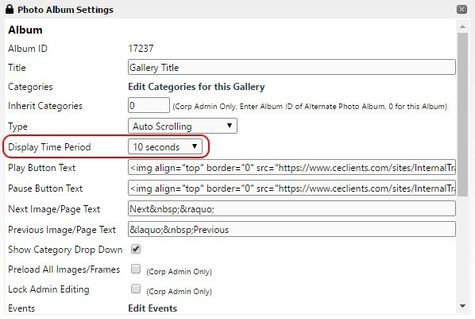
Display Time Period: Determines the length of time between image transitions for auto scrolling galleries.
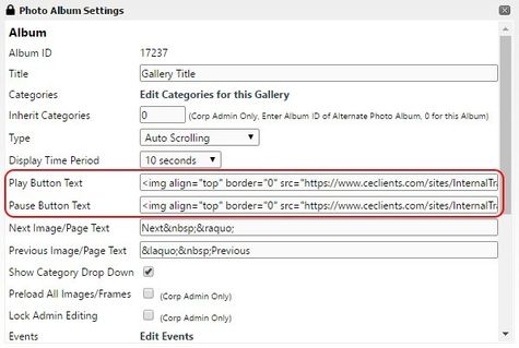
Play & Pause Button Text: Has a default value. Specifies text or images used for these buttons for auto scrolling galleries.
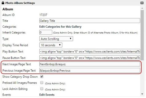
Previous & Next Image/Page Text: Has a default value. Specifies text or images used for these buttons for scrolling galleries.
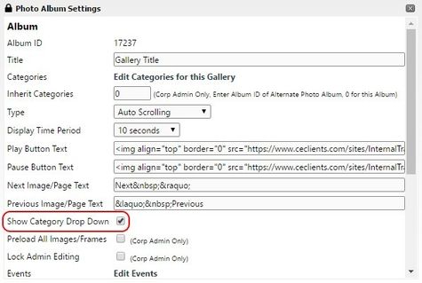
Show Category Drop Down: When enabled, displays a dropdown selection of categories (folders) the user can choose from. Useful when showing multiple events in the same gallery.
Corp Admin Settings Only
Inherit Categories: Use the same image categories as another album.
Preload All Images/Frames: Preload all images rather than during scrolling.
...
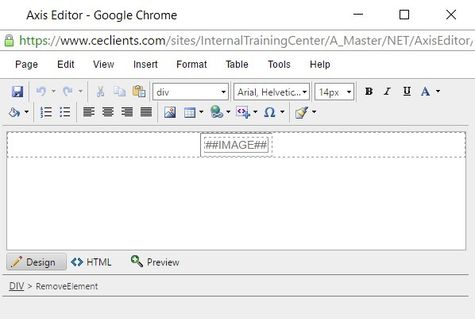
Plugin HTML Layout: Opens up Editor for customizing the overall plugin display (the ‘container’).
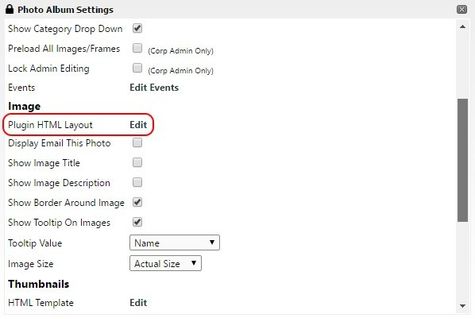
Plugin HTML Layout (Advanced): Editor window for customizing the plugin layout using Snippets and HTML. You can change things like the wrapping of the album, custom borders, transitions, and more. Most of the basic features can be done using built-in options and without the use of this Editor.
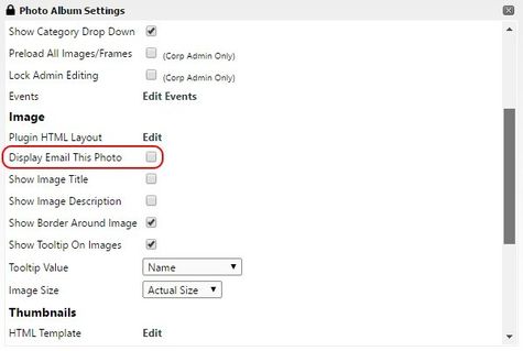
Display Email This Photo: Adds an icon to each image allowing members to email a copy of it. You can choose other members or enter addresses of non-members. Rarely used.
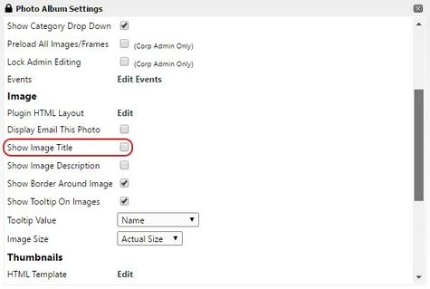
Show Image Title: Adds the ##IMAGETITLE## snippet to the Plugin HTML Layout. This can be positioned and styled by editing the Plugin HTML Layout. The content can be modified in Image Explorer for corresponding images.
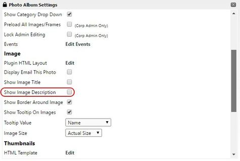
Show Image Description: Adds the ##IMAGEDESC## snippet to the Plugin HTML Layout. This can be positioned and styled by editing the Plugin HTML Layout. The content can be modified in Image Explorer for corresponding images.
Show Border Around Image: Creates a border around the image. Default border that can be edited using the Plugin HTML Layout.
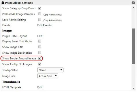
Show Tooltip On Images: Shows the tooltip when users hover their mouse over the image.
Tooltip Value: Specifies which tooltip field is displayed. The content can be modified in Image Explorer for corresponding images.
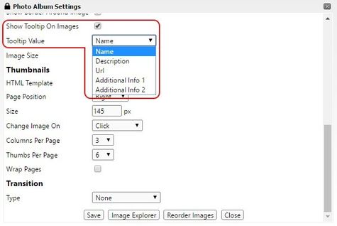
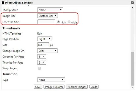
Image Size: Select the image size to be displayed. Options: Actual, Small, Medium, Large, or Custom.
Enter the Size (Optional): Auto-sizes images to either match a specified height or width (but not both to avoid stretching).
Thumbnail Settings
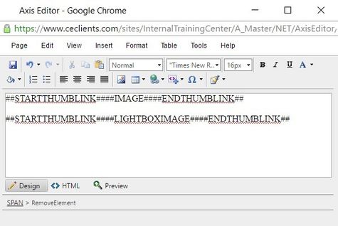
Thumbnail HTML Template: Opens up Editor for customizing the thumbnail display (how individual thumbnails appear).
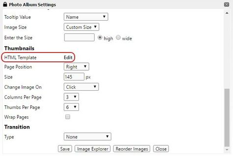
Thumbnail HTML Template (Advanced): Editor window for customizing the thumbnail layout using Snippets and HTML. You can change things like overlays, add hyperlinks to events, and more. The ##LIGHTBOXIMAGE## snippet is a common replacement for the ##IMAGE## snippet. This allows for lightbox usage where the image pops up in the center of the screen while everything else is grayed out.
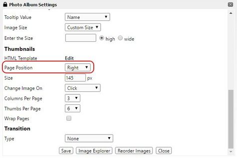
Page Position: Controls the alignment of the thumbnail grid relative to the full image display.Controls the alignment of the thumbnail grid relative to the full image display.
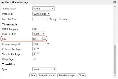
Size: Specifies the thumbnail width only.
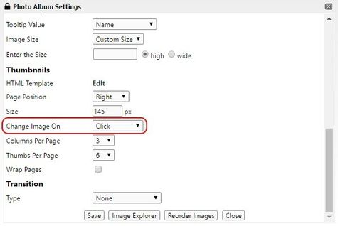
Change Image On: Change image on Click or Mouse Over. Mouse Over is rarely used.
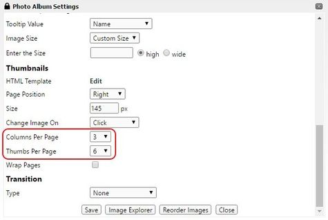
Columns/Thumbs Per Page: Controls the table layout of the thumbnails. 3/6 for example would result in 2 rows of 3 images per page. Left/right arrows exist for browsing additional pages. Thumbs Per Page dropdown automatically adjusts to be a multiple of Columns Per Page.
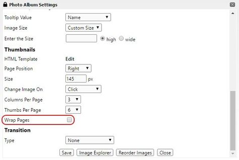
Wrap Pages: When a thumbnail grid is set to display over multiple pages and there are extra spaces on the last page, this places images from the first page of the album on the last page to create a complete grid.
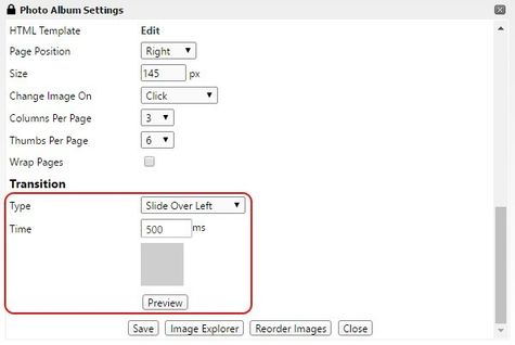
Transition Type/Time/Preview: Specifies the type of transition, time between slides in milliseconds (1000 = 1 second), and provides a Preview button to see a transition effect. None, Fade, and Crossfade are the most common.
FAQs
Q: How do I create a lightbox effect?
...
For banners/events on the home page, make sure all images are the same size or larger than needed. They can always be sized down, but sizing up causes blurriness and pixelation. Most banners are about 3:1 ratio (width:height).
Make sure all images for ‘event galleries’ are in the same orientation (usually landscape), otherwise the thumbnail grid will appear inconsistent.
Structure folders in Image Explorer in a way that makes sense so images are easy to locate. For example, Images/Events/2016/July-4-Cookout is a logical structure.
- When editing an image in PicMonkey, choose ‘save a copy’ instead of ‘save’ in case you don’t like the changes and want to revert back to the original.
- PicMonkey does not recognize PNG transparency. You can use a different (free) online image editor when working with images with an Alpha channel: https://pixlr.com/editor/
- PicMonkey and Windows 10 do not recognize orientation data and will rotate images ‘correctly’ until they’re uploaded. If you run into this, use: https://pixlr.com/editor/ to open your image and go to Image > Rotate (X) > Save.
...