Versions Compared
Key
- This line was added.
- This line was removed.
- Formatting was changed.
Table of Contents
| Table of Contents | ||||||
|---|---|---|---|---|---|---|
|
Overview
The F&B Dashboard will give the Food and Beverage director up to date data to help them gauge the health of their F&B Department. View Revenue and best-selling items in this easy to navigate dashboard.
Each dashboard you access will be composed of various widgets. Some can be modified via filters but also will have options within the widget to drill down for more information and Data. For more information on filtering widgets, please refer to the guides:
General Ledger Navigation
Required Permissions
Club Intelligence Admin
Accessing the Tool
Go to Admin Bar.
Select Club Intelligence.
Select the F&B Dashboard.
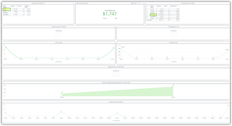
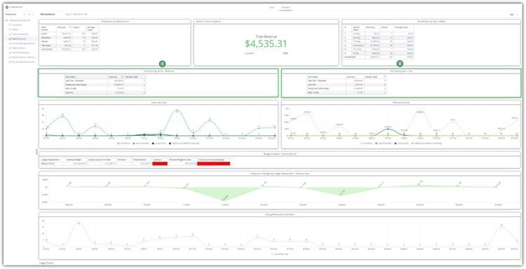
Revenue
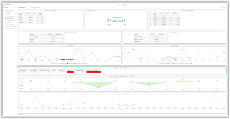
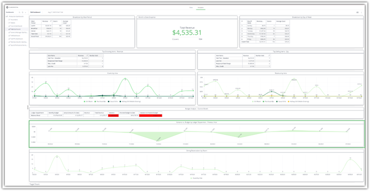
The user’s dashboard will launch, the first set of widgets at your disposal are:
Revenue Breakdown by Meal Period – Shows a spreadsheet breakdown of the meal period data for the given date range in the dashboard. You can see the meal period name, the revenue, the number of covers and the average revenue for covers.
Total Revenue – Total Revenue will show you the selected date range’s total revenue with a cover count.
Revenue Breakdown by Day of Week – This widget will show the user a day of the week breakdown for Revenue, Covers, and Average Cover Revenue.
Please Note: If more than one week is selected the totals for each day of the week will show. I.e., the full month of July would have every Monday’s totals within this widget combined for Mondays.
You may apply filters directly to the above by selecting items in the pivot tables of the widgets. For example, if I choose the Dinner Meal Period from the Breakdown by Meal Period widget and then Friday in the Breakdown by day of Week, the data in the rest of the widgets will load to display the dinner and Friday data only.
Best Sellers
The next set of widgets will show:
Top Grossing Items – Revenue – A spread sheet including the Item Name, Revenue, and Number sold of the top grossing items can be seen here.
Top Selling Items – Qty – A spreadsheet including the Item Name, Revenue, and Number Sold of the top selling items can be seen here.
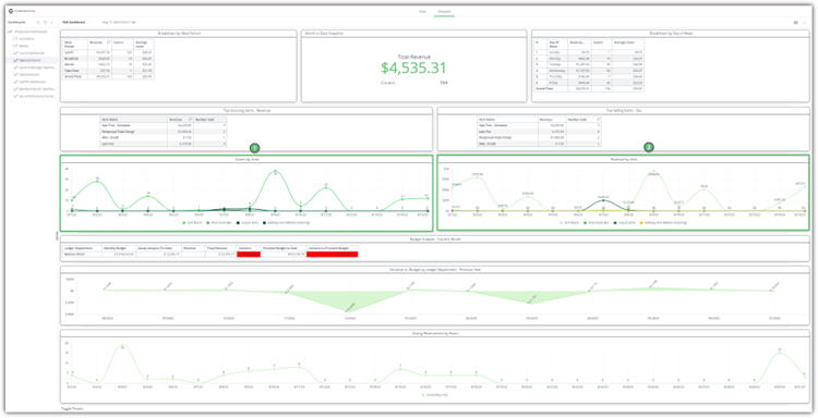
Revenue and Covers by Area
The next set of widgets are visual representation line graphs showing:
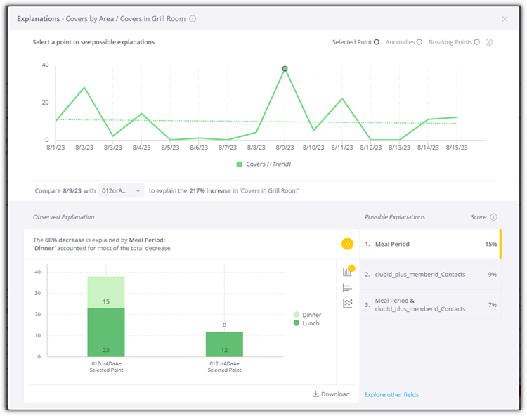
Covers by Area – The line graph will show date, number of covers, and the area they were sold in. Hovering over a data point will show the info for that data point.
Revenue by Area - The line graph will show date, Revenue, and the area they were sold in. Hovering over a data point will show the info for that data point.
The above graphs can be filtered to remove areas by clicking on the area listed in the graph legend.
Budget
The next widget that we see:
Budget Analysis for Current Month – We see both a data chart and a line graph analyzing the trajectory of the department’s:
Monthly Budget.
Actual Amount to Date.
Revenue.
Total Revenue.
Variance from the Budget.
Prorated Budget to Date (Budget divided by number of days in the month then multiplied by number of days so far),
Variance to Prorated Budget (Prorated Budget minus total Revenue).
Variance vs. Budget by Ledger Department – Previous Year – Shows a line graph of the variance to the budget for the previous year.
Dining Reservations
The last widget on the F&B Dashboard looks at:
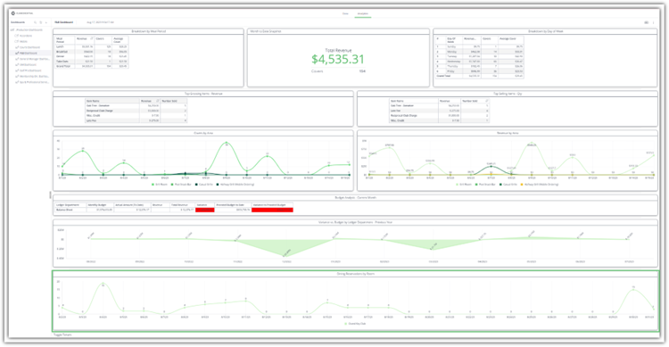
Dining Reservations by Room - The data is presented in line graph format and shows the Date on the X axis and Reservations on the Y axis.
Hovering over the data points in the graph will allow you to see the data and can be used to compare the total number of covers for that day.
Best Practices
FAQs
